Yesterday, a friend of mine started me on a quest that was to be filled with despair. It started innocently enough.
I've just had a thought that blew my mind: Emoji fonts in roguelikes. This.. Changes.. EVERYTHING!
— A powerful cabbit (@Eldritchreality) September 21, 2014I gleefully replied with my 140 character attempt at making that come to life (each Emoji counting, as I would later discover, as two normal characters).

Well, that didn’t look like a bad start. There were some alignment issues there, probably because Twitter uses a proportional font. Nothing that a couple of <pre> tags couldn’t solve!
Oh, how wrong I was.
Twenty-four hours later, this is what I have to show for my efforts:
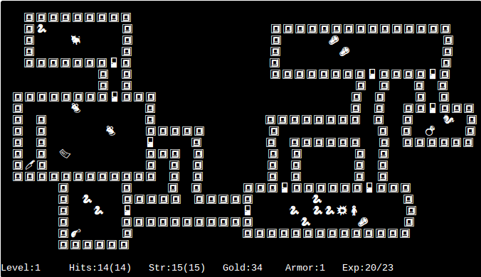
Well, it’s a whole screen of Rogue-like, which is not bad. But despite wrapping the whole thing up in <pre> tags, there are still alignment issues.
Lesson 1. Not all Emoji are a fixed width.
Lesson 2. No Emoji are the same width as a half-width or full-width Unicode space.
This will become important.
You may also notice that the picture above isn’t a nice <pre> block full of text that you can copy and paste. That’s because, after hours of tweaking to get something looking vaguely presentable, I decided to see what it looked like in a different browser.
And even in the same browser, with a different monospace font:
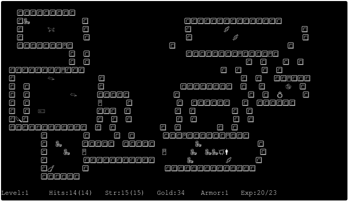
Lesson 3. The width of an Emoji — and even one of the Unicode spaces — varies from font to font.
Before I even got to that point, though, I was nearly thwarted by an even more frustrating issue — actually laying out the Emoji in a text editor.
I assumed that in the world of monospace text that editors inhabit, these problems of layout would be avoidable. Any modern text editor should allow me to edit a bunch of Unicode characters in a regular grid, right?
Of course not.
My first attempt was using gedit, my GUI editor of choice. It happily allowed me to mix standard ASCII and Unicode characters. When I inserted a space between ASCII characters, it was about 20px wide — so far, so good. But when I inserted a space, even a Unicode full-width space, between two Emoji, the result was only 10px wide. The browser renders the spaces correctly, so to look right in the browser, all spaces had to be half as wide in gedit — useless for drawing a dungeon layout.
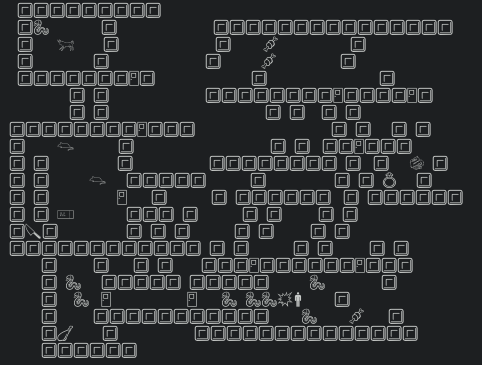
I resorted to vi, my console editor of choice. My console font happily supports Unicode, so this should be no problem!
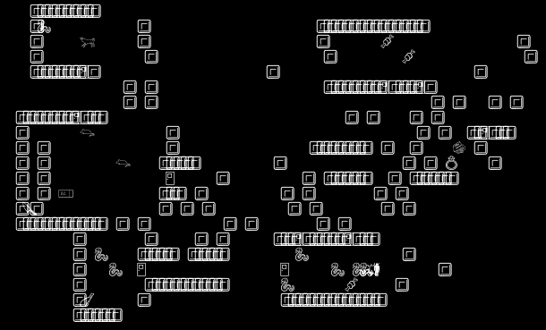
Of course not. For a start, keypresses in vi insert one byte at a time, meaning that every other keypress misaligns every subsequent two-byte Unicode character on that line. And then there’s the quite bizarre way in which it decides to write characters on top of each other.
My third and almost bearable choice was an odd one. I figured that if I wanted the same look in my editor as in the browser, I should use an editor that runs in the browser. I chose the Chrome extension Caret.
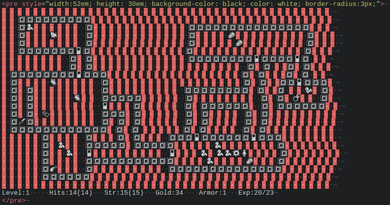
At last I had something almost usable, although the misalignment of characters rears its ugly head here too. There’s the infuriating bug that this only applies to characters on the screen, not the cursor position. 70 characters into a line of Emoji, the cursor position can show up almost two characters away from the text it actually sits at.
Lesson 4. There’s not a single program in the world that renders Emoji the same as any other.
Last but not least, there’s the matter of Emoji fonts.
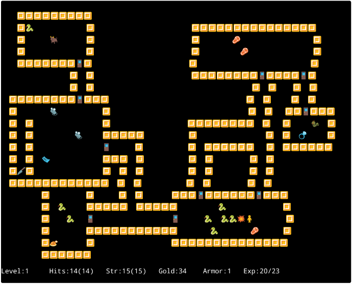
On my Linux machine, my browser and my text editor at least use the same set of monochrome Emoji symbols. But view the same page on an iOS, Android or Windows Phone device, and you’ll discover they have their own platform-specific Emoji fonts which are specifically designed to look great while ruining your attempt at cross-platform compatability. Here’s what our Rogue-like looks like on Android, showing off the inevitable inconsistent widths:
If you’d like to post your hard work to social media sites, you may also discover that Twitter has its own set of unpredictably-sized Emoji. Facebook will at least use your system font when you post Emoji, although trying to edit a post with Emoji quickly results in a field of “your encoding is broken” rectangles.
Lesson 5. Despite Emoji having existed for over a decade, and having been incorporated into Unicode for half that time, Unicode fonts and particularly Emoji in them are a complete mess of incompatible typesetting and platform-specific weirdness. They are not yet suitable for use in layouts — and thus, sadly, for making Roguelike games.
For the curious, here’s how my Emoji Rogue-like would render in your browser. If you use the Cousine font in Chrome on Linux, this might look alright! If you’re using anything else, this is probably a horrible mess.
    🔳🔳🔳🔳🔳🔳🔳🔳🔳
    🔳🐍             🔳                        🔳🔳🔳🔳🔳🔳🔳🔳🔳🔳🔳🔳🔳🔳🔳
    🔳      🐂       🔳                        🔳        🍖                  🔳
    🔳               🔳                        🔳          🍖                🔳
    🔳🔳🔳🔳🔳🔳🔳🚪🔳                        🔳                            🔳
                 🔳  🔳                        🔳🔳🔳🔳🔳🔳🔳🔳🚪🔳🔳🔳🔳🚪🔳
                 🔳  🔳                                       🔳  🔳    🔳  🔳
  🔳🔳🔳🔳🔳🔳🔳🔳🚪🔳🔳🔳                                  🔳  🔳     🔳  🔳
  🔳        🐀           🔳                                  🔳  🔳   🔳🔳🚪🔳🔳🔳
  🔳  🔳                 🔳                   🔳🔳🔳🔳🔳🔳🔳🔳  🔳   🔳     🐉  🔳
  🔳  🔳          🐀     🔳🔳🔳🔳🔳           🔳                 🔳  🔳  💍     🔳
  🔳  🔳                 🚪      🔳           🔳  🔳🔳🔳🔳🔳🔳   🔳  🔳🔳🔳🔳🔳🔳
  🔳  🔳  🎫             🔳🔳🔳  🔳           🔳  🔳         🔳  🔳
  🔳🔪🔳                 🔳  🔳  🔳           🔳  🔳         🔳  🔳
  🔳🔳🔳🔳🔳🔳🔳🔳🔳🔳🔳🔳  🔳  🔳           🔳  🔳         🔳  🔳
          🔳         🔳      🔳  🔳       🔳🔳🔳🚪🔳🔳🔳🔳🔳🔳🚪🔳🔳🔳
          🔳  🐍     🔳🔳🔳🔳🔳  🔳🔳🔳🔳🔳          🐍              🔳
          🔳    🐍   🚪                   🚪      🐍  🐍🐍💥🚹        🔳
          🔳         🔳🔳🔳🔳🔳🔳🔳🔳🔳🔳🔳        🐍        🍖      🔳
          🔳🍗       🔳                   🔳🔳🔳🔳🔳🔳🔳🔳🔳🔳🔳🔳🔳🔳
          🔳🔳🔳🔳🔳🔳

Level:1     Hits:14(14)   Str:15(15)   Gold:34    Armor:1   Exp:20/23
The limited set of Emoji currently available also causes a number of other issues with creating a Rogue-like using the characters. For example, the character set currently does not contain glyphs for:
- Stairs
- Treasure chests
- Corridors
- Kobolds
- The Amulet of Yendor
I’m sure the Unicode committee will be working on these soon.
Comments