Back in the dim and distant past of my school days, Dreaming Awake was called “Dragon’s Claw” and was going to be a video game rather than a book. As far as I can tell from trawling the Internet Archive, not much was posted about it online, but for some reason today I remembered the design work we did on its skill system.
To my knowledge no game since has implemented something like this — probably because it’s not a particularly great idea — but it has a certain elegance to it so I thought it worth documenting.
I think we called the skill system “Chromatic”, or maybe “Prismatic”. Something like that. It was based on the Hue, Saturation and Luminance method of specifying colours on a video screen.

Mechanics
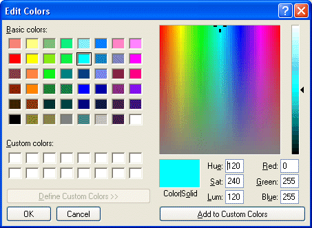
If you’ve ever used a paint program on a computer, you’ve almost certainly encountered this style of colour picker before. There are three axes to it: Hue, which specifies the colour, Saturation, which specifies how ‘colourful’ (as opposed to grey) the colour is, and Luminance, which specifies the shade of the colour from black to white. (Some systems use Value instead of Luminance, the difference is somewhat technical.)

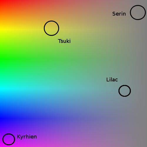
In Dragon’s Claw’s system, the Hue of the colour represents the elemental association of the skill, along a continuum. So for example, Fire-based skills have a red hue (approximately 0 on the scale), Water-based skills have a blue hue (approximately 170 on a 0-255 scale). Something like the diagram below — there were more elements to fill up the remaining space, but I forget them now.

The Saturation of the colour represents the transition between physical abilities and magical abilities, with the physical ones being less colourful and the magical ones more so. For example, the magic spell “Fireball” might be bright red, while “Flaming Sword” is still the same hue but more physical, so has a lower saturation.

Luminance is a continuum between white and black, and represents the balance between “good” and “evil” abilities.

If I recall correctly, while abilities were balanced fairly well across the hue and saturation spectra, the majority of abilities clustered towards the centre of the luminance spectrum as the abilities themselves could rarely be said to be good or evil.
Each character had an innate “colour”, which represented their central position within the three-axis ability spectra. At level 1, a character would be able to use an ability only if it was within 1 integer of their colour on each spectrum. For example, if Rosa has a colour of Hue 0, Saturation 255, Luminance 128 (primary red), she can use any ability with Hue 255-1, Saturation 254-255, and Luminance 127-129. This is a pretty restricted set, although each character would have been designed such that they started with at least one ability.
As each character increases in level, the “sphere” around their innate colour expands, and if any new abilities fall within that sphere, the character learns that ability. By level 100, each character can use a sizeable proportion of available abilities, but never the complete set.

As the character uses abilities, their innate colour changes by a fraction towards the colour of the ability used. In this way, characters’ ability sets can be customised however the player wants, simply by practicing abilities in the right “direction”.
Advantages
I always thought this was a pretty neat way of determining which characters can use which abilities, and the fact that characters get better at certain types of ability simply by practicing them or similar ones, is definitely appealing.
The concept of skills as a continuum also allowed for interesting benefits from the use of weapons. Swords, for example, might increase damage dealt by low-saturation (physical) skills, while staves might increase damage for high-saturation skills. A mace might benefit high-luminance (good) skills, while a dagger might benefit low-luminance (evil) skills.
Disadvantages
There are a couple of big disadvantages, not least that we never found a good way of representing a 3D cube of colours to the player — we were limited by the ability of 2D screens and human eyes to see all three axes at the same time.
Certain areas of the spectrum were also rather sparse — certain hues, saturations and luminance ranges had a lot of abilities in them, while others had fewer, and characters with innate colours in those more sparse ranges would find themselves without as wide a choice of abilities as others.
The system also scales badly with level as originally designed. Each increase in level expanded the “sphere” of a character’s potential abilities in three axes at once, so an increase of n levels results in an increase of n3 volume. The result of this is that characters’ rate of picking up abilities becomes exponential. A logarithmic increase in sphere radius would have been a better idea to control this.
Alongside the difficulty in displaying the colour cube, it would also be difficult for players to discover the locations (i.e. colours) of new abilities that they may want. A lot of work would be needed in suggesting to the player which abilities they might want to practice, and what new things they would learn if they did.
Comments