Scatter graphs are useful when you have two bits of information about some things, and you want to see if there’s some relationship between them.
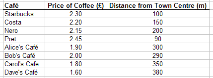
So for example, say you wanted to see if it was more expensive to buy coffee in the town centre than further away. You could go to a bunch of cafes, and write down how much their coffee costs, and how far from the town centre they are. You would end up with something like this:

Now you have two bits of information on each cafe.
Graphs have two axes, X (along the bottom) and Y (up the side). On a scatter graph, you pick one of your bits of information for each axis. It doesn’t really matter which way round you do it, but traditionally if it’s a “cause and effect” relationship we try to put the “cause” along the bottom (X axis) and the “effect” up the side (Y axis).
With our cafes, we think the ones that are close to the town centre (“cause”) might choose to make their prices higher (“effect”). We know it can’t be the other way round - if the high prices were the “cause” and the distance from town centre was the “effect”, then that would mean the cafes actually move when they change their prices!
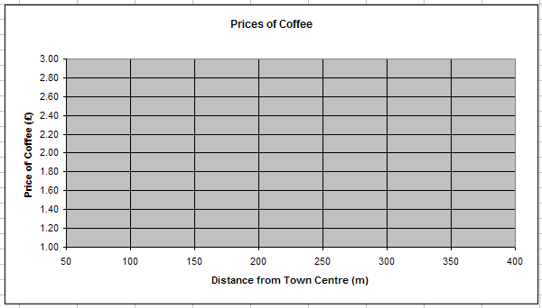
So, we’ll plot the scatter graph with “distance from town centre” (the cause) on the X axis (along the bottom) and “price of coffee” (the effect) on the Y axis (up the side).
For each one, we need to make the numbers on the axis cover the whole range of values. The prices of coffee range from £1.60 to £2.45, and the distances from town centre range from 90m to 380m, so we need to make the axes big enough to cover that.
Like so:

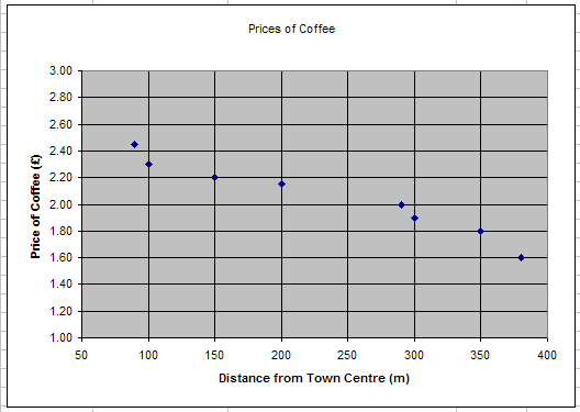
Now each cafe is going to be a point (a dot, or a cross) on this graph. For each one, take its distance from the town centre (along the bottom) and imagine drawing a line going straight up. Then take its price (up the side) and imagine drawing a line straight across. Where those lines meet, draw a point.
Then move on to the next cafe, and keep going until you’ve done them all. The graph will look like this:

Your scatter graph is complete!
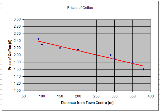
One of the things we often do with scatter graphs is to plot “trend lines”. If you look at the cafe graph, you can see that the blue dots look a bit like a line which is higher on the left and lower on the right.
On the left are the cafes that are close to the town centre, and they have high prices. On the right are the cafes that are far from the town centre, and they have low prices. We can say that there is a “trend” that cafes closer to the town centre have higher prices.
(A mathematician would say that there is a “negative correlation” between price of coffee and distance from the town centre - “negative” because as distance goes up, price goes down.)
If you have been asked to, you can draw a trend line on your graph to highlight this trend. This doesn’t involve any maths (until you reach A-levels… :) - you can just get a ruler, roughly line it up with the points on the graph, and draw a line through like this:

Comments