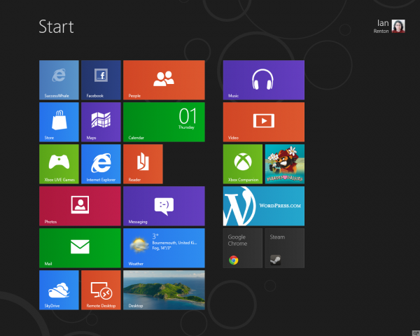
Microsoft’s next operating system, Windows 8, is now available in “Consumer Preview” form – a release designed to let potential customers know what to expect from it when it launches in around six months’ time. It’s probably a very good idea to give it six months to soak in, because just in case the tech media has entirely passed you by, it looks like this:
Nary a Start Menu in sight. Microsoft has gone all-out with its minimal, colourful “Metro” design that appeared first on Windows Phone 7 before coming to the Xbox 360 and finally to the desktop/tablet OS itself.
I say “tablet” there because Windows 8 is very much focussed on the tablet – sometimes, it appears from the Consumer Preview at least, to the detriment of the desktop experience. It makes its point even before you first log in, with its photograph that overlays the login screen. How do you get from there to the login options? Swipe up. Or for a desktop user, the much more awkward click-and-drag-up. (Luckily, pressing a key also works.)
Where’s the Start button? There isn’t one. To get back to the Metro tiles, you swipe in from the bottom-left of the screen, or from the right and press the Start button that appears. Both are easy, if not exactly intuitive, gestures on a tablet but are very awkward with a mouse. The same applies for the task switcher (swipe from top-right). And Metro apps can’t be closed apart from by going to that task switcher and dragging an app off the panel. In practice, for the desktop user, this means relying on the Windows key, Alt-Tab and Alt-F4 instead of the mouse gestures that are just too annoying to use all the time.
The key usability ethos that drove Windows Phone’s Metro interface is that it should be “glanceable”; that users shouldn’t have to go into different apps or do complex things just to see the information that’s important to them. This idea has made it through to Windows 8 relatively intact – there’s a mail tile that shows your new mail, a calendar tile that shows upcoming appointments, and so on. It feels a lot like a phone or a tablet, but what it doesn’t feel much like is a real, multi-function, generic computer.
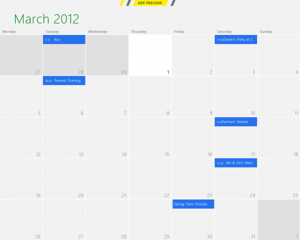
Calendar
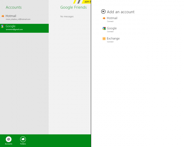
Windows 8 doesn’t break support for all the apps you’re used to, but it does add new Metro-style apps of its own on the top. They’re really, really pretty – and currently unfinished, though that’s par for the course for an unreleased operating system. Above, the calendar’s month view really shines in full screen (though you can’t show more than just your primary Google calendar). Below, the equally pretty and minimal mail app (that doesn’t support generic POP or IMAP accounts yet).
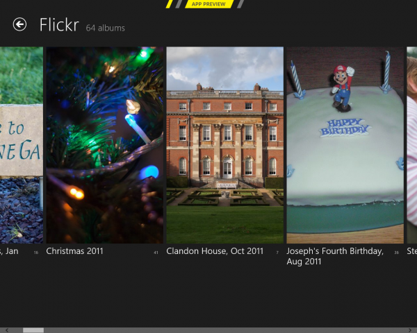
Some integration is very well done, such as the Pictures app which automatically shows pictures from Facebook, Flickr and SkyDrive:
Pictures
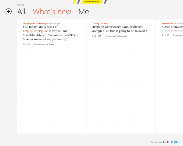
…but some is less well done, such as the “What’s New” page shown below. Huge amounts of wasted space make it largely unusable as a main way of interacting with the Twitter and Facebook feeds that it shows. (It’s also the interface’s only serif text, which is slightly jarring.) Hopefully this app will get a lot of attention before launch.
“What’s New”
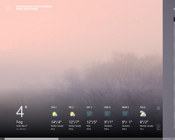
There are a few ugly lines and some odd incidences of 16px Arial bold too, such as in the weather app (below). On any other interface they’d go unnoticed, but given the smoothness and the emphasis on large, thin typefaces everywhere else in the GUI, they stand out.
Weather
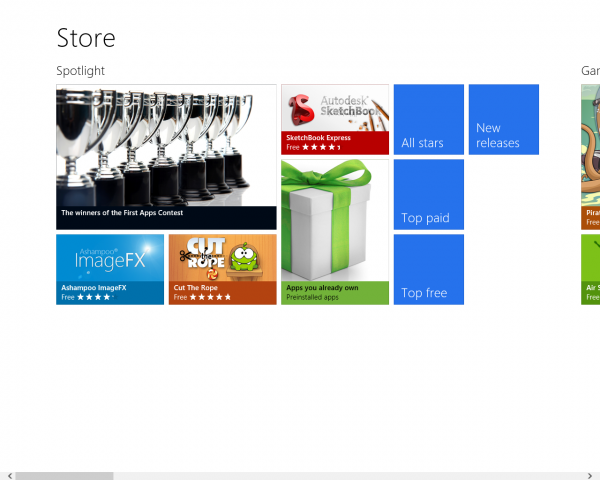
By contrast the new Windows Store really nails the appearance, showing off how beautiful Metro can be. Again, as expected for a pre-release OS, the store is a ghost town with only a couple of dozen apps in total. Apps from the store install and update as expected, which may finally put an end to the manual effort of keeping Windows apps up-to-date, at the cost of putting more of the computing experience under Microsoft’s control. (Of course, you can still download and install apps without going through the store.)
Store
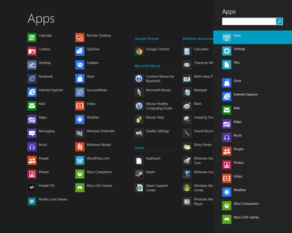
The full list of installed applications isn’t on a Start Menu but is instead part of the system-wide Search functionality, just like on smartphone operating systems. Luckily you can get there just by typing on the Metro “Start” screen, so it works as a decent app launcher for keyboard-lovers.
Search
As you can see, non-Metro apps are included in this list too, and when activated, the main problem with Windows 8 becomes apparent: schizophrenia.
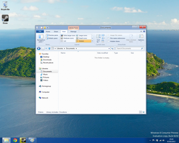
It’s like there are two teams at work on Windows 8 (there probably are) and they refuse to talk to each other or share ideas. From a world of simple minimalism, geometric tiles and large thin fonts, the simple request for a file browser window drops you immediately into this:
Explorer
Five menus worth of “ribbon” interface, icons in ribbons, icons in the title bar, minimise and maximise, location bars, side bars… The Explorer GUI would have looked at home in Windows 7, but against the rest of Windows 8 its needless complexity and over-engineering is staggering.
To the left of the screen are desktop shortcuts that bear no resemblance to your Metro “desktop shortcuts”. At the bottom of the screen, a taskbar that doesn’t include the Metro apps you have open. And of course no Start button, no hint to the novice user that there is a way back to the completely different interface they were using just now. (If you’re wondering, the corner-hotspot-gestures still work, bringing up weird semi-transparent overlays over the Windows desktop.)
For the many people who are going to hate the Metro interface, it’s nice that you can use Windows 8 largely from the traditional desktop – but if you don’t pin all the desktop apps you want to the taskbar, you’ll have to dip back into Metro to launch them. Unfortunately, for those people, there’s no compelling reason to upgrade. The desktop experience is nearly identical to Windows 7, and all Windows 8 adds is a weird extra GUI layer that you hate.
For the people, myself included, that love the Metro interface, we have the opposite problem. Simple productivity tasks can be done from Metro, but to get any real work done – a web browser that supports more than 10 tabs, say, or a word processor, or a game – you’ll be switching back to the desktop interface far more often than you’d like.
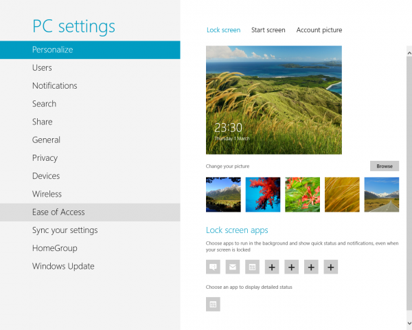
Settings
With Windows 8, Microsoft have set themselves a monumental challenge. Rather than follow in Google and Apple’s footsteps by adapting their mobile OS for tablets, they have chosen to differentiate themselves by adapting their desktop OS instead – the same desktop OS that is used by an estimated 90% of all computer users. If they fail, it will have been an expensive experiment that could cost them ground in the desktop market as well as the tablet market. If they succeed, they will have stolen Apple’s crown as the greatest innovator in desktop operating systems.
This time next year, we’ll know for sure.
In the mean time, I’m rebooting into Linux.
Comments