There have been a lot of rants around the internet of late about “skeuomorphism” in software, largely targeted at the latest versions of Apple’s operating systems. They’ve almost all been negative, possibly because designers hating on the concept are the only ones who felt sufficiently incensed that they looked up the name for it. I’m afraid I’m going to do nothing to buck the trend.
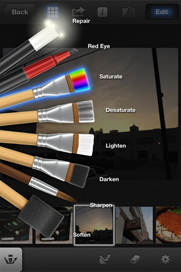
Skeuomorphism is defined as “[producing] a derivative object that retains ornamental design cues to a structure that was necessary in the original”, which in software terms usually refers to making a software interface look like a real-world object. For example, the Apple applications that have recently raised designers’ ire:
Skeuomorphism in software can be useful if (a) the concept the designer is trying to convey is difficult to get across without resorting to real-world objects, and (b) the skeuomorphic interface actually improves things.
In the iPhoto example, the paintbrushes are utterly redundant – the user already knows it’s a photo-editing app. Using buttons instead of photorealistic buttons wouldn’t have made the functions of the tools any easier to understand. In fact it might have been an improvement, as to many users the brushes could imply “this tool lets you draw on the picture”, which is not the case.
In the iCal example, the leather effect adds nothing in terms of usability – in fact it reduces the contrast ratio of the text to the background compared to OSX’s usual grey. All it does is evoke the idea of a leather-bound diary, an object which is fast becoming obsolete. (I tried using a real diary for a while. Gave up when it became apparent that there wasn’t a plugin for it that would sync the contents with Google Calendar.)
And that, I think, is the core of my problem with skeuomorphism. It’s inherently holding us back. Designers of these interfaces have looked at the possibilities of software UIs, glorious blank canvases on which we can draw anything the mind can imagine, infinite spaces of black pixels begging for life and colour, and they’ve chosen to make their software look a bit like leather.
Worse still is where this route leads, because Apple is far from the first company to flirt with these ideas.
Back in the mid-1990s, new and inexperienced users were joining the “computer revolution” in their millions. The advent of mouse-driven interfaces, (relatively) high-resolution and high-colour displays gave software developers a new technique to ease non-technical users into the world of computing.
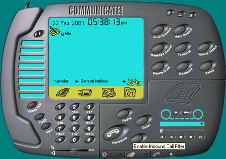
They could make their fax program… look like a fax machine.
Buttons that look like textured plastic! Fake 7-segment displays to tell the time! Eight speed-dials! Huge amounts of wasted space! Curved corners! Cyan! A giant useless phone-shape attached to the side! A “handsfree” button that cannot possibly make the device more hands-free! This interface, and hundreds like it, are things of horror.
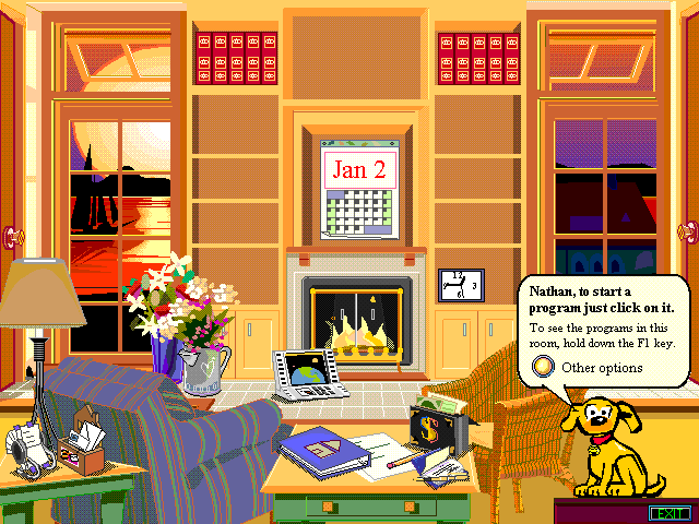
And of course, one company took it too far. They produced a skeuomorphic interface to govern every action the user takes with the computer, an interface so reviled that it bombed commercially and became the in-joke of the software design profession.
Kids: don’t do skeuomorphism. Or you might end up like Uncle Bob.


Comments