What was once my simple Twitter client, SuccessWhale, is undergoing a lot of changes in the build-up to version 2. One of the biggest changes is the support for multiple services, of which Facebook is the first to be integrated. This, combined with the Twitter website’s new design, brings into question SuccessWhale’s “reply” UI.
There’s no question that there should be a big “type your status update here” box at the top. Both incarnations of Twitter do this, Facebook does this, every non-mobile client (and a few mobile ones too) does it. It’s what users expect, and I see no reason not to stick with it.
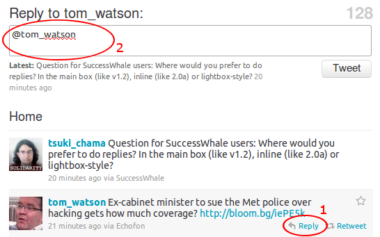
About a thousand years of internet time ago (2010), replying to a tweet from Twitter’s website re-used that top status box for the reply. The user clicked the “reply” button, and the status box got pre-filled with “@” plus the username of the person they were replying to. It looked like this:
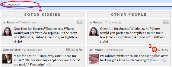
SuccessWhale, then solely a Twitter client, copied this behavior. Its reply UI involved clicking a “reply” button and having its main “publish status update” box update with the replied-to user’s name, like this:
Now SuccessWhale is attempting to be a Facebook client, too. On Twitter, replies to a status update are given virtually the same prominence as the original status. On Facebook however, posts are more thread-based, with comments on a status update clearly being daughter objects of the original update. Status updates themselves use “newest at the top” order, just like Twitter, but comments on an update are “newest at the bottom”. So on Facebook, it makes sense for the “reply” field to be inline, like this:
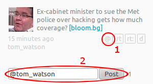
In playing around with the UI for SuccessWhale version 2, I introduced an inline reply box, which works something like this:
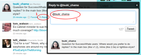
A third reply UI was introduced with the new Twitter website - a floating “lightbox”-style reply area which appears when the “reply” button is clicked. Like this:
So, between the two sites that SuccessWhale currently talks to, we have three UI paradigms for replying to a status update. I feel it is very important for SuccessWhale to have a consistent UI for replying, particularly when we introduce columns that mix updates from Twitter, Facebook and potentially other sources.
So, my question to SuccessWhale users is: which one do you like best? I have no particular attachment to any of them, so let’s get our democracy on. Your choice is between:
-
Using the main status update box (like SuccessWhale version 1 and old Twitter)
-
Using an inline box (like Facebook)
-
Using a pop-up ‘lightbox’ (like new Twitter)
The comments are yours, vote away!


Comments