I started using Last.fm back in 2006, in the final months of my time at University, and have carried on using it up until a few months ago, despite coming to the conclusion that I should stop back in 2011. Although the social media narcissism of “everyone must know what I’m listening to!” is no longer appealing in these days of over-sharing, I kept my Last.fm account around for its free “recommendations” streaming services until deciding earlier this year that a Spotify subscription was a worthwhile investment.
I was reluctant to delete my account, though, as seven years of listening to over 30,000 songs is a lot of data — so much that it feels wrong to click a single button and pretend it never happened.
Luckily, I’m far from the first person to want to turn their years of recorded listening habits into some kind of accessible permanent record. The most famous such service, LastGraph shut down earlier this month — annoyingly on the very day that I intended to use it — but there are many other ways to get interesting data from a Last.fm history.
Last.fm Playground
Last.fm offers their own visualisation tools in their “Playground” site. Many are for subscribers only, but even free users get access to some interesting graphs.
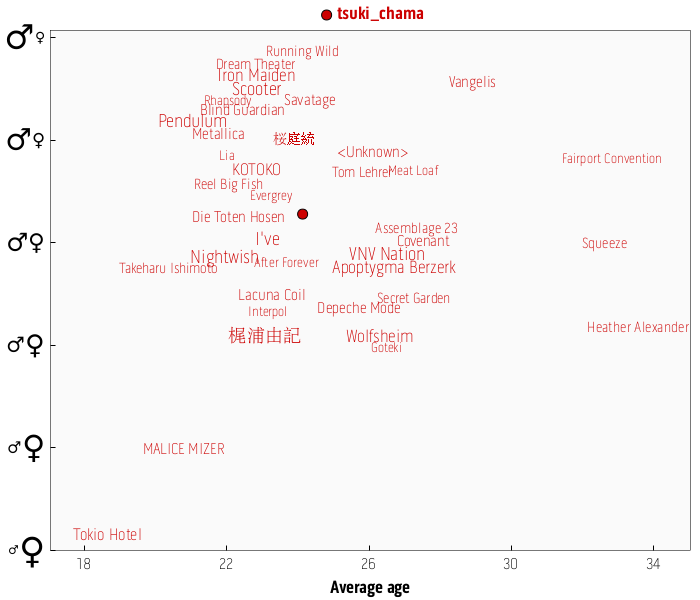
For example, the Gender Plot uses your history to guess your gender and age. As you can see below, Last.fm pegs me as 24 (I’ll take that as a compliment) and it’s pretty indecisive on my gender — a largely manly playlist conflicts with my fondness for Tokio Hotel, apparently only listened to by 18-year-old girls.
Last.fm Graph
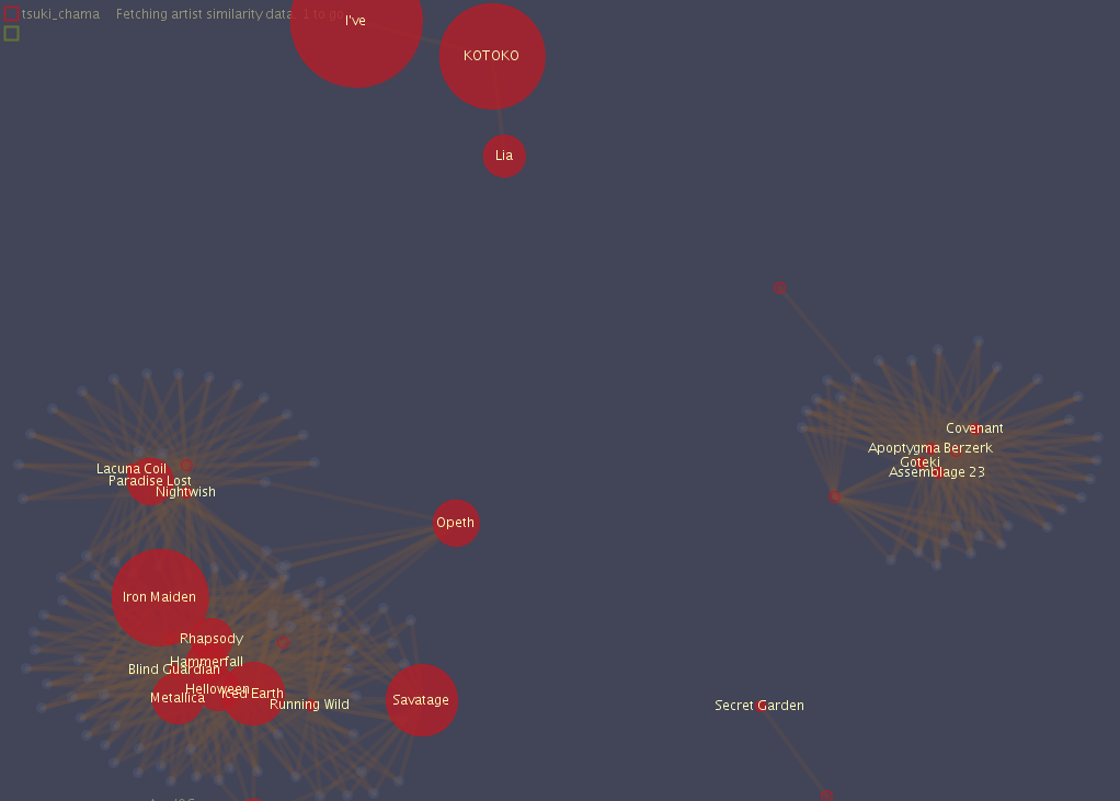
Last.fm Graph is a third-party Java app that takes your favourite artists and displays them as a network graph, showing the interlinking between them. The result is interactive and designed to be played with, which unfortunately makes for a pretty poor screenshot.
According to my output, my main genres of metal and EBM don’t intersect anywhere — perhaps they would have if more industrial acts had made the “top 50 artists” cut-off that I used for the data set. My 2006-2007 J-Pop phase is sitting on its own separate from everything else (and deservedly so).
Last.fm Extra Stats
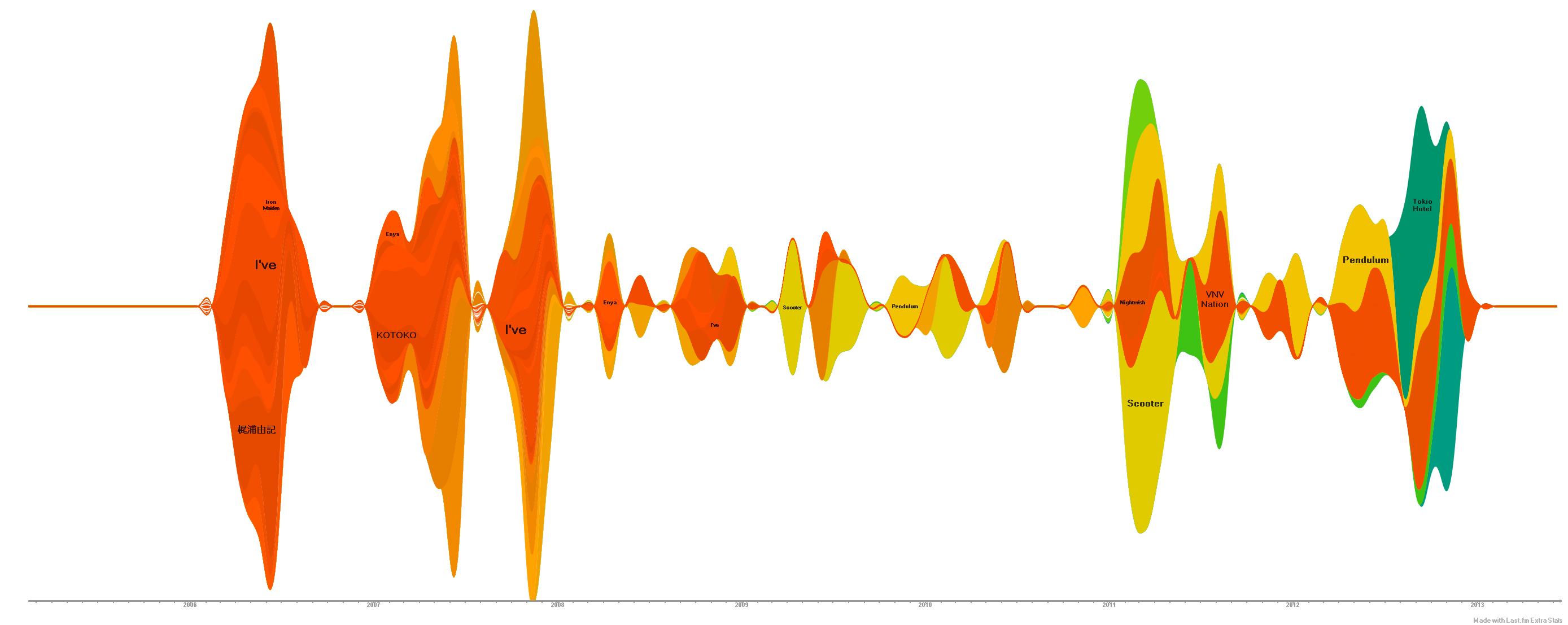
Last.fm Extra Stats (Windows only, .NET 2.0) generates much the same graphs that LastGraph did, more configurably but perhaps a little less pretty. Everyone’s favourite is the “Wave chart” view, showing trends in listening to your most popular bands over time.
Here, the amount of music I listened to — or at least, the number of tracks I scrobbled to Last.fm — dominates the chart causing a very bumpy output, but it’s all there. The sheer volume of Kotoko and Scooter tracks I’ve listened to are now laid bare for the world to see and silently judge me on.
LastHistory
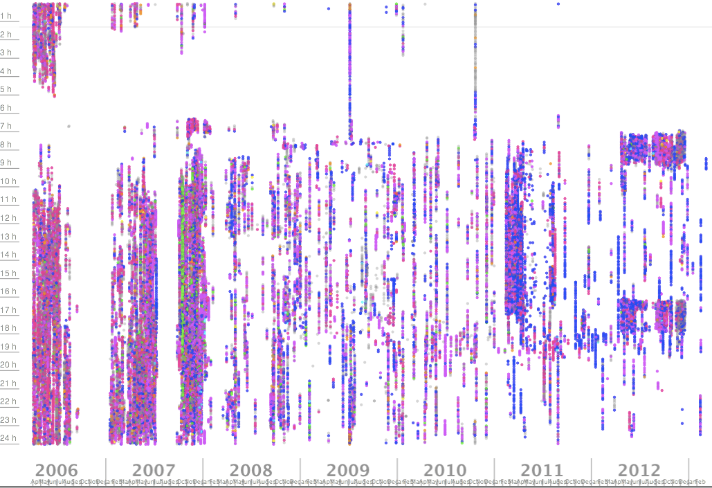
My favourite of the bunch has to be LastHistory (OSX only). It’s not the prettiest visualisation, but what it does do is not just plot your listening over time on a day-by-day basis, but minute-by-minute. The resulting visualisation displays information about your life, while others simply display your music.
In this history I can see my varying sleep patterns as I changed from student to office worker to father. I can see the all-nighters I pulled and what music I chose to accompany me. The days when I listened to music only on my commute, and the rarer interludes where I managed a whole day of listening.
Reminiscence rears its head in strange places, few stranger than a 30,000 point data set began one day with a 20-year-old thinking people on the internet would be interested in his music.
Today I delete my Last.fm account, thankful for the opportunity to look back over seven years of my life summarised in scrobbles. I hope this page proves useful for anyone else in a similar situation, looking to extract pretty graphs — or even memories — from their Last.fm history.


Comments