Day 15 of the Raspberry Tank Build Diary saw me briefly back on my “home turf” of user interface prototyping. If you were expecting an in-depth usability study, I’m sorry to say you’ll be disappointed – this stage is close enough to my day job that I don’t have the enthusiasm to go all-out on a user interface that only my friends and colleagues will ever use.
So without further ado…
Step 1: Sketching
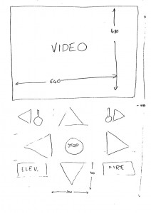
I began by sketching a user interface design. I wanted to create a UI suitable for use on portrait-orientation tablets and phones, and on these devices the user tends to hold them at the bottom with the thumb(s) falling naturally over the lower half of the screen. It seemed natural, then, for the lower half of the screen to contain the controls, and the upper half to contain the video feed.
There are eight main controls for the tank: forward, reverse, turn left, turn right, turret left, turret right, turret elevate, and fire. The lower half of the screen being roughly square, I arranged these into a 3-by-3 grid, adding a central “stop” button that would forcibly stop the tank in case multi-touch on the other buttons created a JavaScript race condition that mucked up the internal “default” state that the web UI will send to the tank if no buttons are pressed.
The initial sketch looked like this:
Step 2: Mocking
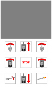
The sketch was then turned into a full-colour mockup of the interface. Rather than simple arrow buttons or buttons with text, I decided to emphasise the square shape from the grid, making each button an identically-sized square. Pictorial icons were used to help users understand exactly what each will do.
The icons were drawn in Visio, and you can download them in SVG format here.
The final mockup looked like this:
Next time on the Raspberry Tank Build Diary, we’ll build this site with some HTML, and add the JavaScript code that will react to the user pressing the buttons.


Add a Comment