Slate’s recent article, “2011 Was a Terrible Year for Tech”, coins the term “mom-bomb” for the moment that technology journalists declare a gadget so easy-to-use that it is actually useful to people who aren’t technology journalists:
He begins by praising the gadget’s intuitive interface and its easy setup process, but eventually he finds that mere description doesn’t adequately convey the product’s momentous simplicity. That’s when he drops the mom bomb: This thing is so easy that even my mom could use it.
I’m blessed with parents that, by and large, ‘get’ technology. Their VCR never flashed 12:00 (and now they have a DVD recorder); they both have Android phones that they can happily e-mail from. My grandparents are a different story, of course. Two of them have almost never used a computer, but my Granddad has a nice new shiny one and uses it regularly. But as the article points out, what tech journalists and we tech-savvy users think is simple and ‘user-friendly’ often falls far short of the ‘mom (or granddad) test’.
A few observations spring to mind:
- Moving photos from a digital camera to a computer is one of the simplest tasks non-‘tech-savvy’ users often want to do. But when you plug in a digital camera, Windows 7 helpfully pops up this dialog:
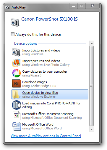
Do I want to “Import Pictures and Videos” using Windows, or using Windows Live Photo Gallery? What’s the difference? Do I want to “Copy pictures to [my] computer”? Do I want to “Download images”? Where will the photos go? Will they still be on the camera? I just want to see my photos, so I click “Open device to view files”, but what the heck is “DCIM”?
- I set Google as his browser homepage, and since then, he has been getting his news not from the BBC News bookmark I created, but using the ‘News’ link on Google’s own menu that appears at the top of its pages:
…which is great, except that Google can change that menu at any time. And of course they are doing exactly that:
To my granddad, and many other novice internet users, the distinction between bookmarks – which only change if you want them to – and web page navigation menus – which can change at the webmaster’s whim – is not necessarily clear.
- Even simple mouse commands can be unclear and difficult. In the example above, Google’s instruction to find the new menu is to ‘roll over’ the logo. When the novice user figures out that means ‘hover the cursor over’, they’re greeted with a JavaScript popup which will disappear again if their cursor accidentally wanders too far from the popup.
It’s my family duty to be tech support, and occasionally I am called upon to fix things that have actually gone wrong. But more often than not, I am called upon to try to rationalise a simple task that is unexpectedly complex to perform. This complexity has usually arisen because the software’s developers and most vocal users are so immersed in common UI paradigms that they just don’t notice that the complexity exists. For the novice user, on the other hand, even your software’s installation wizard is complexity they’d rather not deal with.
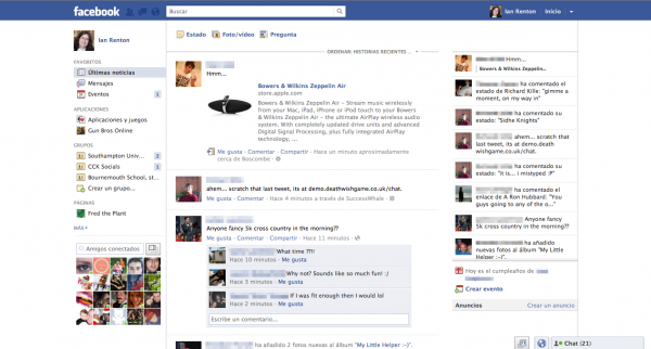
The Slate article is right to cite Facebook’s user interface as a particularly onerous example of software complexity. Feeds, live updates, inboxes, hidden inboxes, walls, profiles, Timeline, comments, likes, tags – some users need and revel in that level of complexity, but a significant number just want to, say, see what their kids are up to. I’m nervous that one day soon, my granddad will ask me to set him up with a Facebook account. I’ll dutifully comply, log him in, and give him this:
Where does one even begin? There are multiple feeds, multiple menus, pop-up and pop-down boxes. How do you add one of these “status” things? How do you add a friend? How do I send a message to someone? What’s public and what’s private? Why is there so much stuff?
In the world of User Experience (UX) design, we spend so much time thinking about how software will be used and by whom – personas, use cases, red routes and all the rest. But in the majority of software I see when working with novice users, it seems that either the novice user has not been considered, or their persona is paid lip service while the latest excitingly complicated new features are bolted onto the software.
As creators of software and of user experiences, I know we can do better than this.
Do you have any thoughts on how we can design better for the novice user? Just want to vent about an app with a particularly poor UI, or about a relative with a particularly poor grasp of computing? Fire away in the comments below!
Comments
I am not sure that what you want should exist in a single UI. Trying to create a UI that can be used by /everyone/ is probability not going to work.
I really hate it when people create UIs with buttons marked 'advanced' - it just means 'I do not know where to put this'. instead perhaps more apps should have several user modes that group together levels of functionality?
At the last BarCamp i was at someone made a very good point that software should be like a musical instrument - possible to master. we we generally get the days though is 'one size does not quite fit anyone'.
Very much agreed. I'm sure there are some apps that have such limited functionality that a simple UI could cover all users, but most -- Word, Facebook, etc. -- have such a wide range of functionality that a simplified GUI would not suit all users.
I would love more software to have multiple modes to cover widely different users. The briefly-trialled "Facebook Lite" interface would have been better for people like my granddad -- no apps, no games, no live feeds, just a simple chronological list of status updates. So long as the app offers an easy "upgrade" path for users who have moved beyond the functionality of the simple interface, and an easy "downgrade" path if the full thing is scary, I can't see the harm. (But of course, it does add extra development effort.)
This also brings to mind the Smashing Magazine article from a week ago about <a 0="" href="http://uxdesign.smashingmagazine.com/2011/12/28/myth-of-sophisticated-user/" rel="nofollow noopener">http://uxdesign.smashingmagazine.com/2011/12/28/myth-of-sophisticated-user/</a>" rel="nofollow">The Myth of the Sophisticated User</a> -- a provocative title, but the point it's making is that sometimes the experienced user wants a simple interface too.
The thing is, it is getting better. Touchscreen interfaces have forced a lot of funtionality out, bringing in big clear buttons to press. It's a pain in the arse for us, losing so much screen real estate to chunky buttons, but it's the kind of thing the basic user needs. You might be onto something with the different interfaces for different levels idea but this isn't new; I remember a version of Nero which launched with a basic interface and the option to change it into "I know what I'm doing" mode. Maybe we lost the idea along the way somewhere. But then again putting different users on different interfaces causes problems when using someone else's PC, or when a user on the advanced interface is called upon for tech support by someone on the basic one; all the options are in different places, some are missing altogether, and watching someone who should know what they're doing rooting through menus doesn't fill the less technical user with confidence.
I'm pretty familiar with this kind of stuff, I know quite a few people who aren't all that great with technology. Those things that are a little different every time you turn the PC on are a nightmare to less confident users. Sometimes the startup programs launch in a different order, meaning the icons in the system tray never quite look the same. We wouldn't care about that, but to someone who relies on familiarity it's very offputting.
Popup windows are the worst. There's no manual for a computer, so when something unexpected happens how do you know if it was supposed to, or if you broke it? Usually connected to available updates, to us it seems easy as anything to decide between ok or later, but to people who don't understand what it's trying to do it's just plain confusing. Flash player decides to update just after Windows loads... what is Flash player? Someone at work just panics and clicks the "close dialog" box every time she opens Firefox and sees its update available window, I dread to think what version she's running.
The surprising one was the computer programmer who, getting his first mobile phone a few years back, struggled to figure out how to use it. Think about it; every mobile phone works in a similar, yet slightly different way. But the manuals all assume you've owned a handset before. So for a complete beginner picking up their first handset in 2008, there's very little instruction there. He has an Android phone now so there was a happy ending to this one, but when someone you wouldn't think of as being technologically challenged struggles with a common device it really makes you think.
Regarding touchscreens, they are better at providing simplified interfaces as all the components need to be finger-size, though there are trade-offs -- on-screen keyboards that are much harder to use than real hardware, for example.
The problem of different users (for example the user giving and the user receiving tech support) I think is mostly mitigated by being able to easily switch from one to the other.
You're definitely right about inconsistency and pop-ups though -- anything unexpected on the display can cause confusion and often an immediate phone call! :) I've had quite a few calls of the form:
After some of the people I work with, I'm not too surprised anymore when I encounter a programmer who can't use a smartphone. Hell, there's at least one programmer there who doesn't have a home computer! It's a case of UI paradigm recognition, I think -- touchscreen smartphones have only become mainstream in the last five years, so their interactions (swipe, pinch to zoom) are still not as embedded in everyone's mind as the 30-year-old point and click.
I've not investigated smartphone manuals in a long time -- my last few phones have come with a tiny quick start booklet and a proper manual on PDF on the phone's microSD card. Unfortunately, accessing the manual seems to require the user to already know how to mount the phone in USB Mass Storage mode and find files on it using their desktop OS. Not very helpful for the complete beginner!
"Popup windows are the worst. There's no manual for a computer, so when something unexpected happens how do you know if it was supposed to, or if you broke it?"
Similarly with the anti-virus example, this is just an example of people not reading what it says! Now I'm not going to claim that these messages aren't a bit cryptic sometimes, but if people just read the messages and paused for thought, they'd get a lot further!
Is text the wrong modality for delivering these messages? They don't always convey enough information, so linking to a web page might help, but that's more to read, and people don't even read the error message! Would an embedded YouTube video help? Stepping you through visually what will happen if you click yes or no, so you're better informed.
In the case of popups, I think it would improve the experience for novice users if applications could have a configurable level of notification tied into the configurable UI complexity.
In my antivirus example, for instance, as an advanced user I'd like to be asked first before it goes and accesses something via the internet. But my father-in-law doesn't care, he just wants a virus-free computer with no interaction on his part, so there I think "update without prompting the user" is a reasonable behaviour.
The problem is, no matter how many times you ask them to, a lot of the time people won't just pause for thought, they'll either dismiss the popup out of hand (the computer is, after all, being rude in interrupting them) or assume that the computer doing something they didn't expect means that they did something the computer didn't expect -- i.e. they've Done Something Wrong.
Yeah, I like your idea of configurable level of control and complexity. It almost needs to be an OS level setting, like Parental Controls are on games consoles. Then you go to Control Panel and set up grandad's PC on 'smooth' interaction setting, and applications are encouraged to adhere to this setting.
Why do you like to be asked before your anti-virus accesses the Internet? Even as an experienced user, I get narked off at applications continually checking if it's alright that they update themselves. Almost invariably I say yes. And popping up to tell me it's done. Just go away! Updating is one of those things that, as long as it's free, users really don't need to know or care about. Chrome does it right. That's constantly updated, but I never hear about it.
The "interrupting them" point is interesting. With a human-to-human interaction most people would deal with it. At a restaurant, you'd expect the waiting staff to confirm your food selection, suggest an alternative wine and ask how rare you'd like your steak. But for some reason people are more dismissive of computers, when in fact they need more clarification!
I just wonder if the HCI were different (if a voice said "excuse me Ian, your anti-virus is about to connect to the Internet to get updates, please say 'No' if you want to stop it"), would people engage more?
I'm not really sure why I like to be asked before applications on my PC connect to the internet -- I have no problem with push messages on my phone, so I seem to be a bit inconsistent! :) I guess it's just that if I'm actually using the computer, it seems courteous for software to ask "is it actually okay if I saturate your bandwidth and CPU for a couple of minutes?" rather than just doing it.
I'm not convinced a voice UI would catch on -- most people feel pretty silly talking to a device, even when it's sort-of conversational like Apple's Siri. And with no human "warmth" to the conversation, I think people would get even more annoyed at it interrupting! :)