Google has a new version of the Android Market app on the way, and just like every other tech blog in the world, here’s a preview.
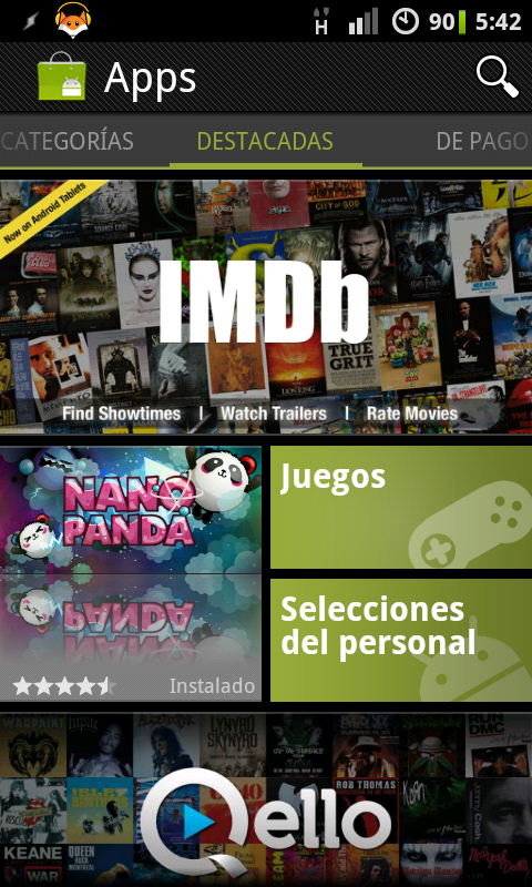

The home page has taken inspiration from Windows Phone 7’s tile interface, making the browsing experience visually richer and much more interesting to flick through. Each app category has its own home-screen in this style, like the Games one shown above-right. While they’re an improvement terms of aesthetics, I’m not convinced it’s an improvement in usability. There’s less visual separation between tiles than on Windows Phone, meaning that large flashy app logos tend to drown out the more useful category buttons. It’s a little confusing, too, that “Staff Picks” and “Editor’s Picks” receive home-screen buttons, while other lists must be swiped between.
The available lists have, handily, been expanded. As well as the two mentioned above, the existing “Top Paid” and “Top Free” lists are joined by “Top Grossing”, “Top New Paid”, “Top New Free” and “Trending”. It’s not immediately apparent what the criteria are for each, but it at least allows more options for app discovery.
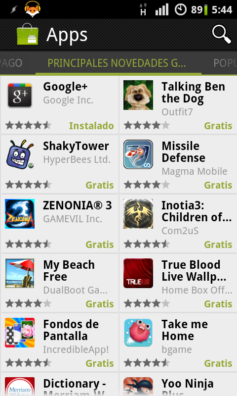
The apps within each list and category are arranged more mundanely than the home screens, in several columns depending on the screen orientation. You get to see more apps at once than before, at the expense of being able to see their full names. Incidentally, the localisation could use some work - I infer from the contents that tab at the top of the above-left image says “Principales novedades gratuitas”, but the tabs don’t get larger for languages that aren’t quite as succinct as English.
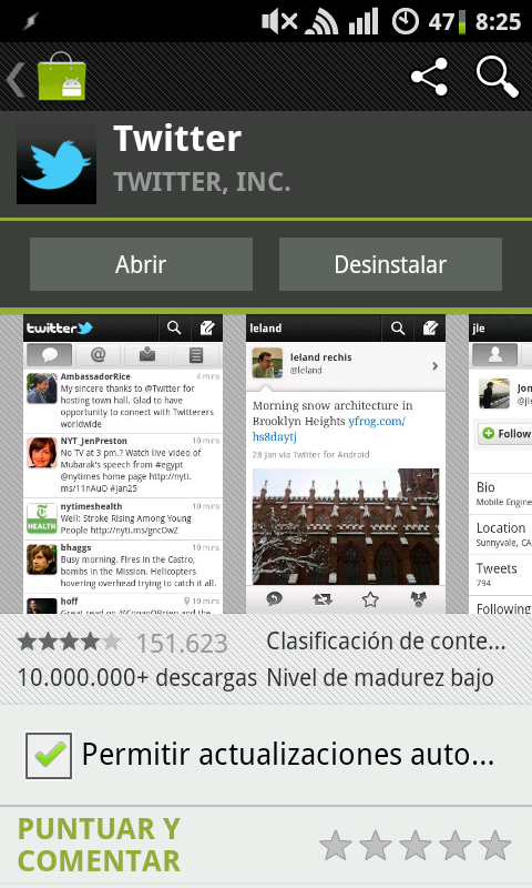
Above-right, the individual app pages now prioritise large screenshots and offer built-in sharing options, but otherwise offer the same features as before.
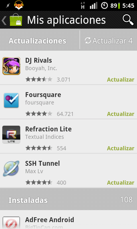
Less welcome is that the “My Apps” page – which must be visited to perform upgrades – is now hidden behind a menu option. That said, it’s visually improved, and when updating multiple apps at once it now performs the downloads and installs one at a time, hopefully preventing a number of installation failures that used to result when two or more apps hit the “install” phase simultaneously.
The Google Mobile blog promises movies and books integrated with the Market for US customers, which may explain why I didn’t see these options on my UK phone. There is also a rumour that rooted devices will be unable to play movies from Google’s service due to licencing restrictions.
Oh, and the best thing about the new Market version? You don’t have to wait for it to be rolled out to your phone in a few weeks’ time. Provided you have non-Market application installs supported, you can download the APK right here.
Comments
I wonder why they chose the Window's interface to draw inspiration from. It certainly looks more colourful and 'exciting' but I'm not sure that that's what the android brand is all about. To me, it seems like a gimmick, but I haven't used it much. I imagine it tested well or they wouldn't have gone ahead with it.
I still prefer it to the iPhone version!
For me, I think Apple's App Store has the edge in terms of simple-but-attractive design (at least on iPhone/iPod, I haven't tried it on an iPad). The old Android Market was getting there, though it had a few rough edges, while the new Market excels in appearance but throws away most of the simplicity it used to have.
Simplicity is the key for me. I don't have a huge desire style phone I still have the relatively smaller screen and filling it up with (ok pretty) graphics seems to go the wrong way for me as all I want to do is find the right app for me then install it. the presentation should really be logical, clean and fast rather than pretty and cluttered.
I've only seen this version of the market on HDPI (480x800-ish) devices, not MDPI (320x480) or LDPI (240x320), so the interface might be different on those devices. Certainly the font used on the tabs ("principales novedades gratuitas" etc.) and the scrolling screenshot area don't look like they'd look good at a lower res, so maybe they're different on platforms with lower-res screens. Or, in that annoying Googly way, the new market app might just not be rolled out to those devices, splitting the ecosystem again :S