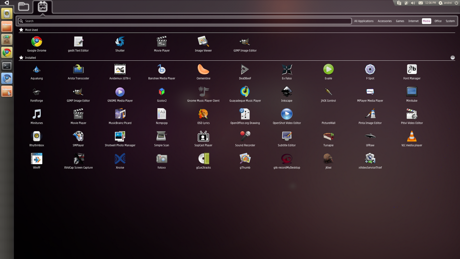
I was working up to a blog post on Ubuntu’s new “Unity” interface a couple of days ago, but repeatedly stalled when it came to making a point. The only point I could come up with was essentially just “I don’t like this”, which isn’t the greatest of subjects for a blog post – to say nothing of the hundreds who have trodden that territory before me.

It’s a fairly bold new direction for Ubuntu’s UI, and the first time their default interface has really diverged from what the upstream GNOME project provides. Now I don’t like it for a number of reasons: it’s slow, it doesn’t provide some basic functionality, other functionality is really well hidden (Go on, re-order your icons. Try it.) and it’s got an “our way or nothing” approach to handling workspaces.
On one hand, as a software guy whose main specialisation is user interface design, I understand the urge to try new UI paradigms as often as possible, on the grounds that sooner or later you’ll discover something that really is better than what you currently have. On the other hand, I quietly despair at how far off that “something better” seems.
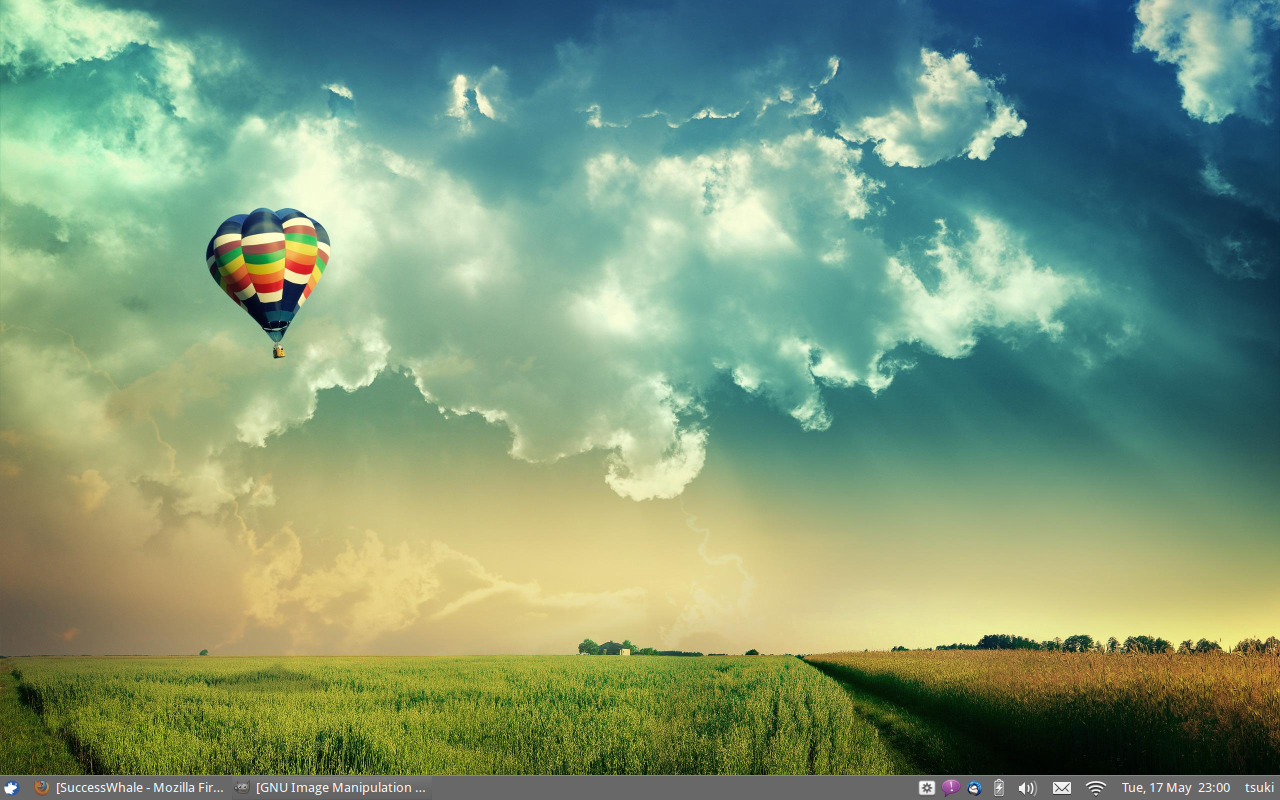
Take, for example, me. I’m a UX person, and a perfectionist when it comes to interfaces. I’m irritated by slightly-wrong fonts and icons a couple of pixels out of alignment. I love new things, new ways of organising and displaying data. I’m big on augmented reality. And my desktop looks like this:

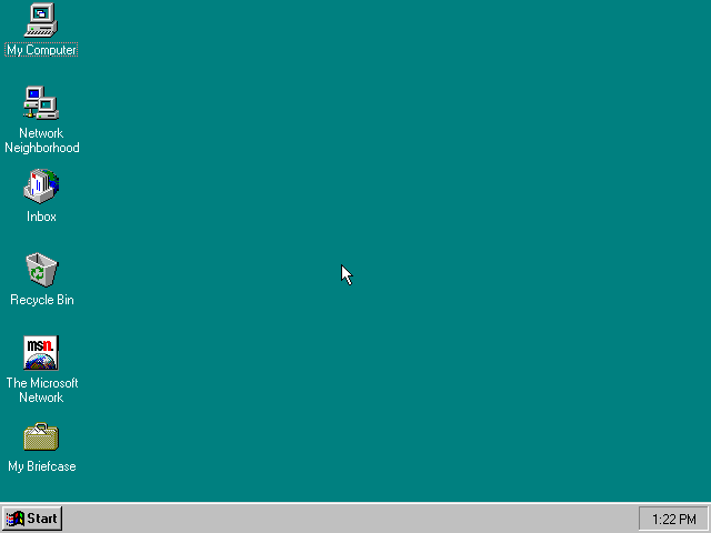
Now I think that’s aesthetically pleasing, but in terms of functionality, it resembles nothing quite so much as:

Yeah, that.
The only notable exception is GNOME-Do (think Launchy on Windows or Quicksilver on OS X), which I use exclusively for launching apps. The main menu, lower left, only gets used if I forget the name of something. Aside from that, I’m using my computer in exactly the same way I was 16 years ago.
The reason for that, as far as I can tell, is that it is the UI of least resistance. In sixteen years, probably 99% of my computer-using time has involved an interface that’s very similar to that one. Sure, there are certainly better UIs out there. Maybe from an objective point of view, Unity is one of them. But for more than half of my life, my brain has been slowly optimising itself for the Windows 95 style interface.
To become the “next big thing” in desktop UI, a new paradigm must not only be better than what came before, it must be so much better that our brains don’t mind losing half a lifetime’s worth of learning.
That’s a milestone I haven’t seen reached lately on the desktop, and a fear we may not see it reached before “the desktop” stops being a thing.
Comments