In one of my previous blog posts, “Designing for Granddad”, I examined some of the user interface features that cause my grandfather issues when using his computer, and left a few hanging questions as to how we software designers can make our apps less confusing to the novice computer user.
As is my unfortunate habit, I spent some of today checking out how work had progressed on the GNOME-shell and Ubuntu Unity desktop environments. (I enjoyed the eye candy for around three hours before reverting to the UI of least resistance.) Various complexities in their interfaces irritate me and seem to have provoked the wrath of a community of largely experienced computer users. This got me thinking about how I would go back the other way, and design a desktop environment for absolute novice computer users – one without many of the frustrations of modern software.
The Gnome-Shell Interface
My ideas, roughly distilled into a sort of ‘design manifesto’, are:
-
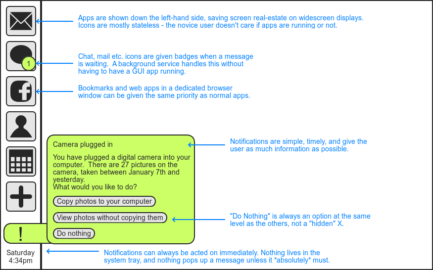
One activity at a time. Here I actually agree with Gnome-shell and Unity’s focus on full-screen applications, avoiding unrelated yet overlapping windows.
-
Never hide the means to change activities. Both Gnome-shell and Unity hide their application switcher during normal use, requiring at least a mouse movement or a click to get it back.
-
Don’t change state with mouse position. Novice computer users often have trouble controlling the mouse. Unity’s auto-hiding dock and Gnome-shell’s “hot corner” could prove frustrating, particularly the latter which completely changes the display when hit.
-
No system trays. The distinction between the taskbar and system tray is not well-defined and can be confusing. Gnome-shell is a particularly bad offender here, with not one but two tray-like areas.
-
No notifications (unless they help). Pop-ups confuse and scare novice users. If at all possible, the app should use a sane default rather than asking a question, and do nothing rather than displaying information. If a pop-up does appear, it should be helpful and clearly worded.
-
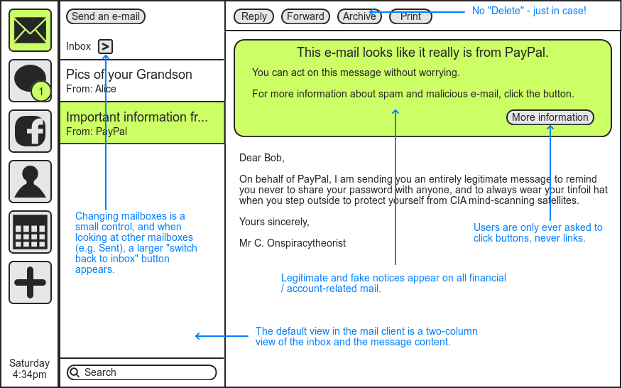
Stateless apps and background services. The user wants to get their e-mail. Reading e-mail is a legitimate activity, but leaving a mail client open so that they are notified of new mail is not. Use background services so that it doesn’t matter which apps are running.
-
Zero tolerance on UI clutter. While UX people like me may sometimes deplore clutter and idolise minimalism on aesthetic grounds, for the novice user, every bit of clutter is something that they feel like they should know how to use.
-
Explain things clearly. Keep words to a minimum, but ensure that the user always feels confident that they know what clicking a given element will do.
-
Undo everywhere. Offer an “undo” option wherever possible. If you’re dealing with small but important items (such as e-mail), consider offering a non-destructive way of getting e-mail out of the user’s face – “archive” instead of “delete”.
-
Use icons and words together. Novice computer users may be young or old, and users of any age may have poor vision or may not speak the language in which the interface was written. These may result in users finding either icons or words easier to understand on a control. Providing both, by using clear iconography and simple text together, helps to alleviate this problem.
I’ve mocked up a couple of interfaces to show a desktop environment that adheres to these principles. The first shows the “desktop”, taskbar and an example notification:
The second shows the mail app with example messages:
Is there anything you particularly like or hate about the mockups or the design principles behind them? Bear in mind that if you consider yourself tech-savvy or a software designer yourself, you’re probably not the target audience for this desktop environment – pretend to be your mother or grandfather for a minute and see how you feel about the suggestions I’ve made.
I’m happy to go further with these designs if you think it’s useful, and of course your own ideas and suggestions are more than welcome. The comments section is yours!
For anyone wondering, the mockups in this post were generated with Mockingbird, an excellent UI mocking web-app.
Comments
I guarantee people won't get what all those icons mean. That's the biggest problem I have with my mum using her computer, she just doesn't understand what the icons are trying to suggest.
What is the + sign? What is the blob with the (1)? etc etc. I can guess, and I'm not afraid to experiment by clicking on things, but for the majority of users not familiar with icons (and I'd warrant even some who are) they wouldn't understand and would be paralysed by fear of clicking on the wrong thing.
I agree with a lot of your points, but the actual implementation is supremely difficult.
You're right, I kind of go against the 'manifesto' bit by not providing text for the main taskbar. Maybe something like this?
<img class="aligncenter size-full wp-image-11973" title="Simple Desktop Environment - Better Taskbar" src="http://onlydreaming.net/wp-content/uploads/2012/01/3.-Better-Taskbar.png" alt="Simple Desktop Environment - Better Taskbar" width="83" height="491" />